John was overweight, out of shape, and experiencing fatigue. What did he do? He removed foods rich in refined carbohydrates and sugars from his diet. He also ditched industrial seed oils and started exercising. He used HealthCorrelator for Excel (HCE) to keep track of several health-related numbers over time (see figure below).
Over the period of time covered in the dataset, health markers steadily improved. For example, John’s HDL cholesterol went from a little under 40 mg/dl to just under 70; see chart below, one of many generated by HCE.
However, John’s blood pressure varied strangely during that time, as you can see on the chart below showing the variation of systolic blood pressure (SBP) against time. What could have been the reason for that? Salt intake is an unlikely culprit, as we’ve seen before.
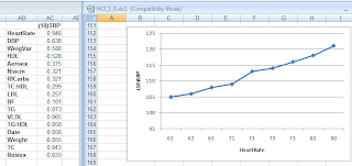
As it turns out, John knew that heart rate could influence blood pressure somewhat, and he also knew that his doctor’s office measured his heart rate regularly. So he got the data from his doctor's office. When he entered heart rate as a column into HCE, the reason for his blood pressure swings became clear, as you can see on the figure below.
On the left part of the figure above are the correlations between SBP and each of the other health-related variables John measured, which HCE lists in order of strength. Heart rate shows up at the top, with a high 0.946 correlation with SBP. On the right part of the figure is the chart of SBP against heart rate.
As you can see, John's heart rate, measured at the doctor's office, varied from 61 to 90 bpm. Given that, John decided to measure his resting heart rate. John’s resting heart rate, measured after waking up using a simple wrist watch, was 61 bpm.
Mystery solved! John’s blood pressure fluctuations were benign, and caused by fluctuations in heart rate.
If John's SBP had been greater than 140, which did not happen, this could be seen as an unusual example of irregular white coat hypertension.
If you are interested, this YouTube video clip discusses in more detail the case above, from HCE’s use perspective. It shows how the heart rate column was added to the dataset in HCE, how the software generated correlations and graphs, and how they were interpreted.
Reference
Kock, N. (2010). HealthCorrelator for Excel 1.0 User Manual. Laredo, Texas: ScriptWarp Systems.


No comments:
Post a Comment